Con Edison · McKinsey Digital Lab
Energy Efficiency Program Platform
Incentive Navigator: redesigning how contractors, customers, and utility staff move an energy efficiency upgrade from application to inspection.
Replaced a PDF-and-phone-call application process with a guided digital workflow, starting from a 7% onboarding completion rate.
Mapped and designed for four core process stakeholders: applicants/contractors, inspectors, an operations team, and a product/platform team, on top of a wider discovery process covering six-plus roles.
Ran a structured 12-sprint testing program, moderated concept testing early, unmoderated usability testing once the full flow was built, then iterated the design directly from findings.
Drove a 50% increase in monthly applications, with 40% of customers moving forward into actual efficiency upgrades.
Trained both engineering and leadership, modeling design-engineering collaboration for Con Edison's own team and setting leadership up to understand and embed user-centered thinking in the product cycle, then trained the in-house designer who took over the product.
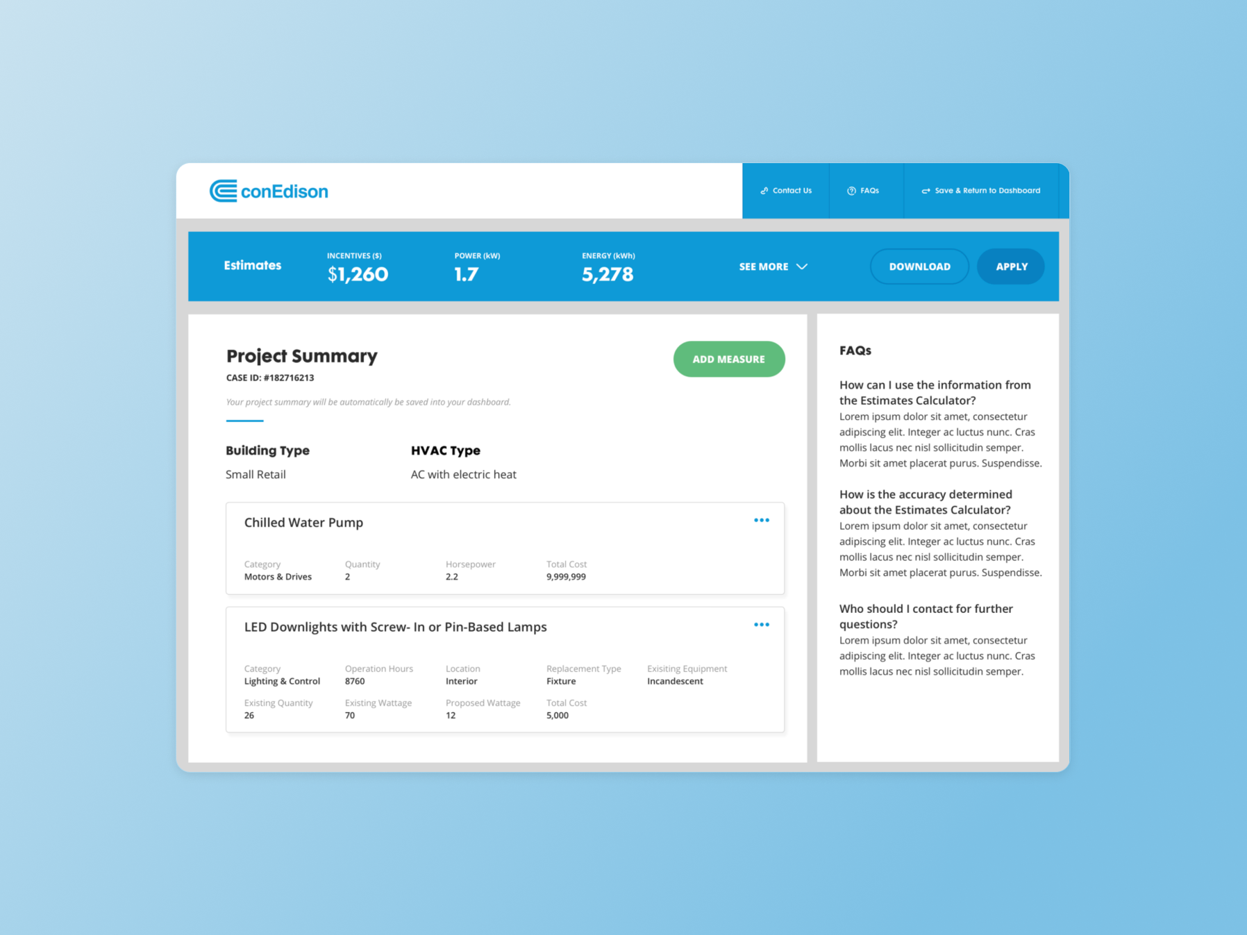
The Estimates Calculator: a customer's project summary, with incentive, power, and energy totals calculated as measures are added.
Context
Con Edison's energy efficiency programs gave customers financial incentives to upgrade to more efficient equipment, but the application process ran almost entirely on PDFs, phone calls, and legacy internal tools. Prospects moved through an Awareness → Application → Processing funnel, and only 7% of prospects who'd had an initial conversation about the program went on to submit an application.
Participating Contractors were central to the funnel. Energy consultants, energy analysts, and project managers at outside energy firms build project proposals off a rebate estimate, take the project through their own approval process, and collect the customer information and materials the application needs. Anything that slowed them down slowed the whole funnel down.
Two goals anchored the project: meet the energy savings and power consumption targets for the Commercial & Industrial program, and increase conversion from initial conversation to submitted application.
Discovery
Understanding the constraints came first. Energy policy, technical impediments, data infrastructure, and rebate guidelines all shaped what was actually possible. That meant talking to more than internal stakeholders: business developers, engineers, operations, program managers, inspectors, and Participating Contractors all had a stake in how this worked. Alongside interviews, the team reviewed existing program data and feedback, and walked step by step through what a Participating Contractor currently went through to submit an application, before assuming what the new version should look like.
Three frustrations kept surfacing, underneath a lot of individual nuance: a manual, duplicative application process that took far longer than it should; Participating Contractors struggling to communicate the actual savings benefit to a customer deciding whether it was worth it; and scheduling that ate up enough time and cost that it became its own barrier, not just an inconvenience. The response had to streamline and simplify, educate and empower, and build in transparency that hadn't existed before.
Defining the MLP
Ideation started with a workshop alongside stakeholders, building on personas and journeys mapped from the current-state research to get a shared, concrete picture of the problem. That produced a co-created list of features and concepts spanning the full onboarding journey, which then got tested against real users, first as wireframes, then as prototypes, to see which features actually resonated rather than just sounded good in a workshop.
The MLP (minimum lovable product) that came out of that process: a guided onboarding experience for the Commercial and Industrial Energy Efficiency program, centered on an incentive estimator and a pre-inspection scheduler, built on top of existing tools rather than replacing them outright. The goal was a centralized system giving Participating Contractors their tools in one place, shorter project timelines, and more visibility into where a project stood.
Four pieces of functionality carried most of that definition into the shipped product:
Incentive Estimator
A guided questionnaire that auto-generated branded estimate PDFs, replacing manual back-and-forth to figure out what a customer qualified for.
Instant Inspection Scheduler
Self-serve scheduling that replaced what had been weeks of email coordination between contractors and utility inspectors.
Data Transfer & Transparency
Real-time status updates so contractors and customers could see where an application stood without calling in.
Consultant Tools
Tracking, document generation, and customer support surfaces built for the utility-side consultants managing the program.
Mapping the process across stakeholders
Before designing screens, the process itself needed to be mapped end to end. A project moves through five phases, platform setup, application, review, onsite inspection, and installation, and four groups touch it along the way: the product team maintaining the platform, Con Edison's Demand Management Tracking System (DMTS), the inspection team, and the operations team reviewing and issuing approvals.
Laying out the full swimlane diagram surfaced where handoffs were fragile: steps with no defined owner, information that had to be manually re-entered between teams, and points where a project could stall waiting on one group without the others knowing why.
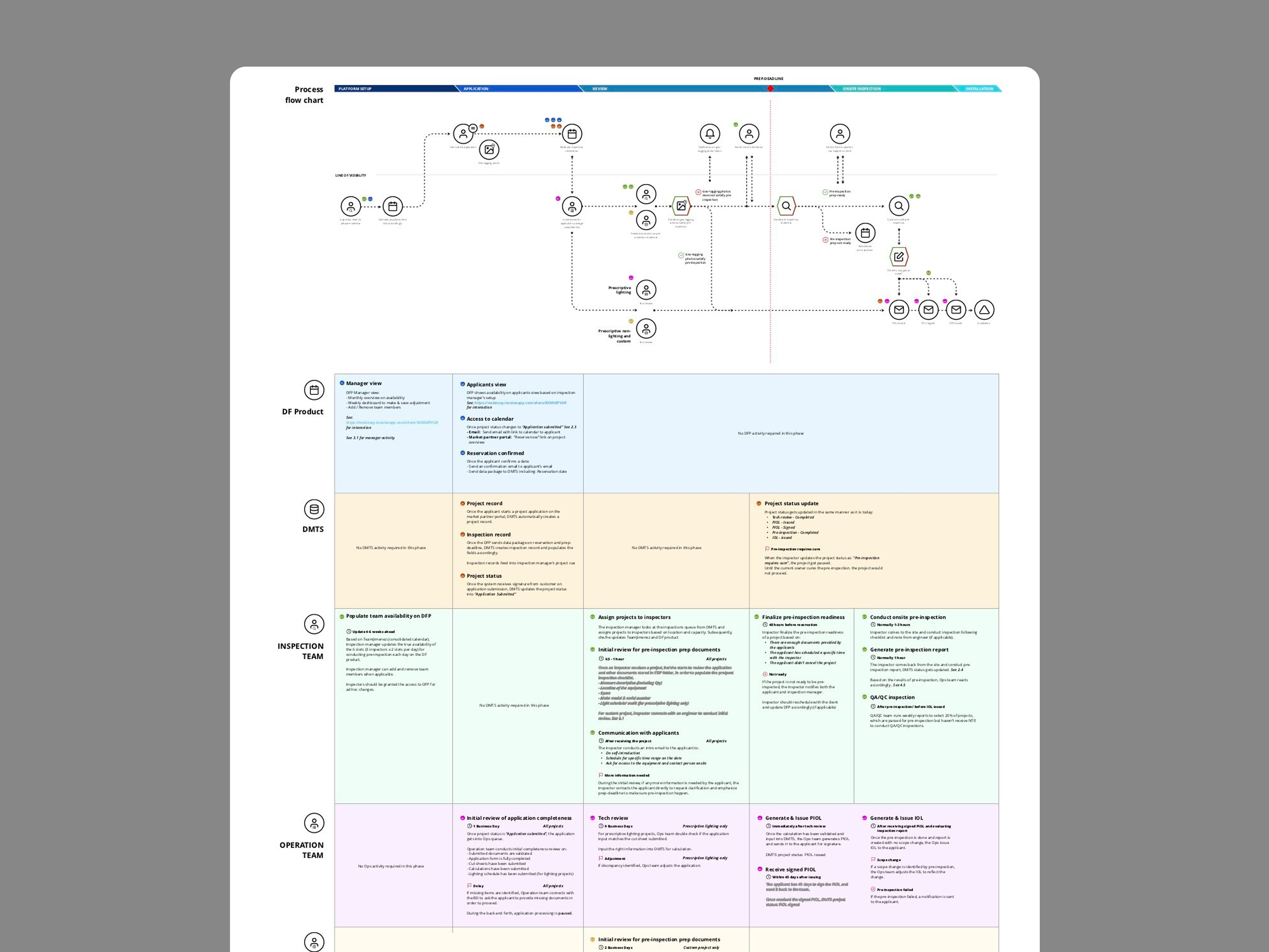
Full process flow chart: five phases, four stakeholder swimlanes, mapped end to end before any screen was designed.
UX inspiration and analysis
Three products outside the utility space shaped the design direction more than any energy-sector competitor did: Robinhood's risk-free demo trade, for how it let someone try the core action before committing to it; TurboTax's contextual help embedded directly in the tax flow, rather than routed out to a separate help center; and Insurify's car insurance savings estimator, for how directly it got a user to a concrete number before asking for a commitment. All three informed the decision to lead with a fast, low-commitment estimate before asking a customer or contractor to start a full application.
Designing the estimator flow
The Incentive Estimator had to support four different equipment categories, VFD fan/pump, HVAC and heat pump, lighting, and lighting controls, each with its own required inputs, its own optional inputs, and its own calculation logic feeding into incentive amount, energy savings, ROI, and simple payback. Some categories branch further still: lighting includes a separate sub-flow for refrigerated display lighting with its own required fields.
The flow was diagrammed at the field level before any UI was built, and used to organize and validate the data directly with Con Edison's program engineers before it fed into the product. Required inputs, optional inputs, and calculated/estimated outputs were color-coded as distinct types, which made it possible to spot where the questionnaire was asking for more than it needed before that showed up as a usability problem in testing. The lesson that came out of this piece specifically: present the data efficiently and logically, and simplify every function for ease of use, rather than mirroring the complexity of the underlying rebate logic just because it was accurate.
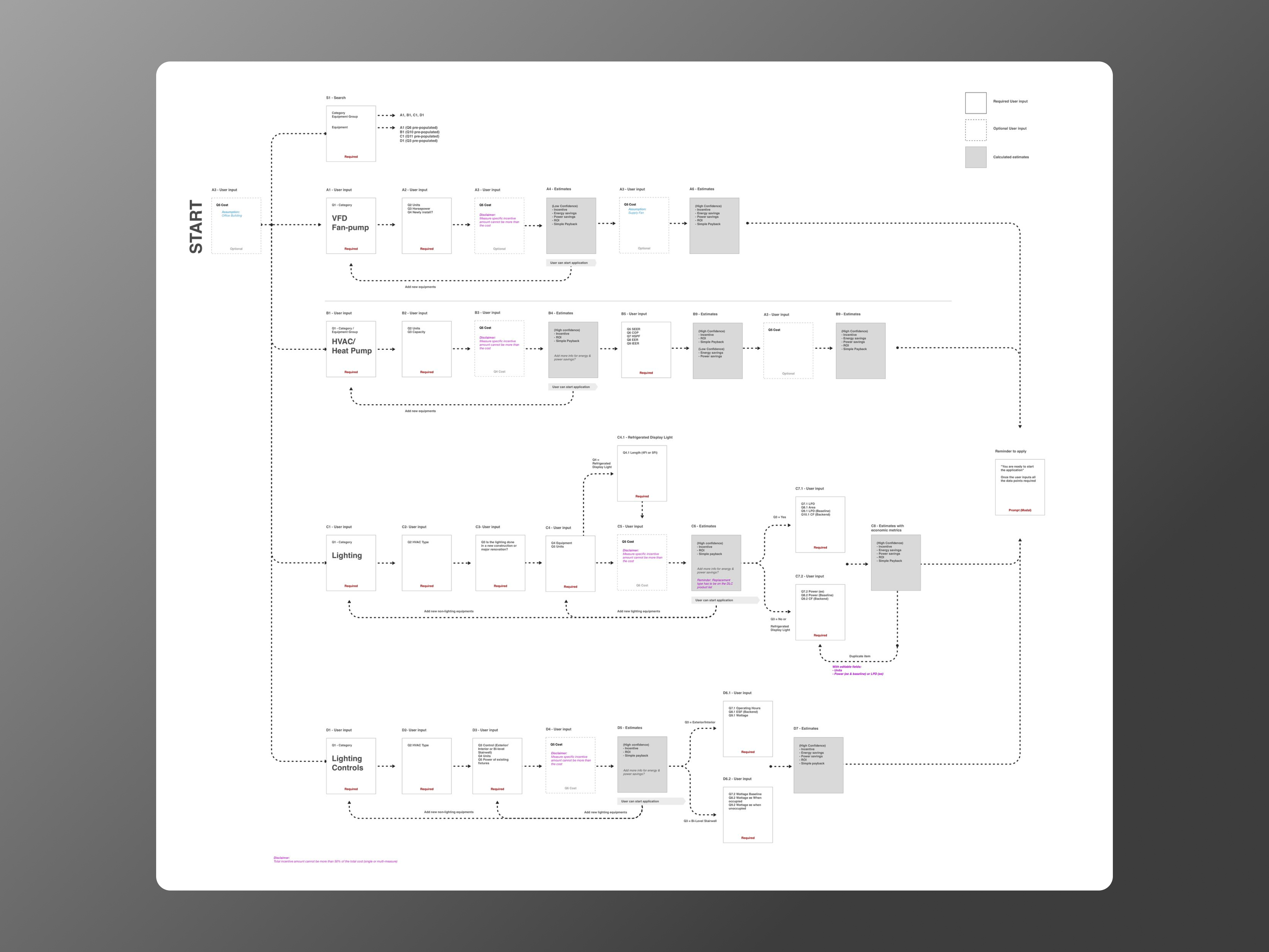
Field-level flow for the Incentive Estimator, covering VFD Fan-pump, HVAC/Heat Pump, Lighting, and Lighting Controls paths.
Walking through the estimator
What shipped, screen by screen:
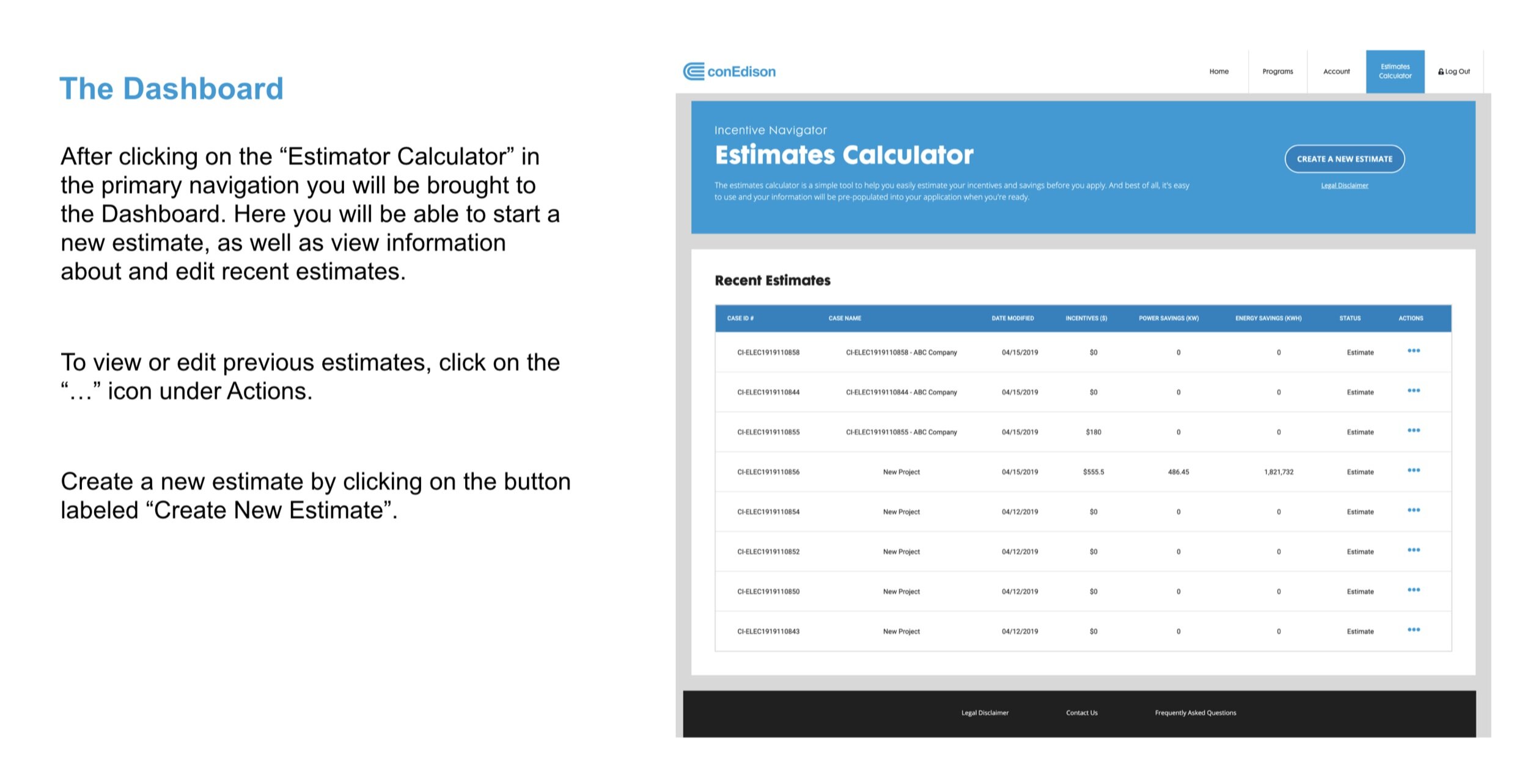
Dashboard. Entry point after clicking into the Estimates Calculator: start a new estimate, or view and edit recent ones from the actions menu.
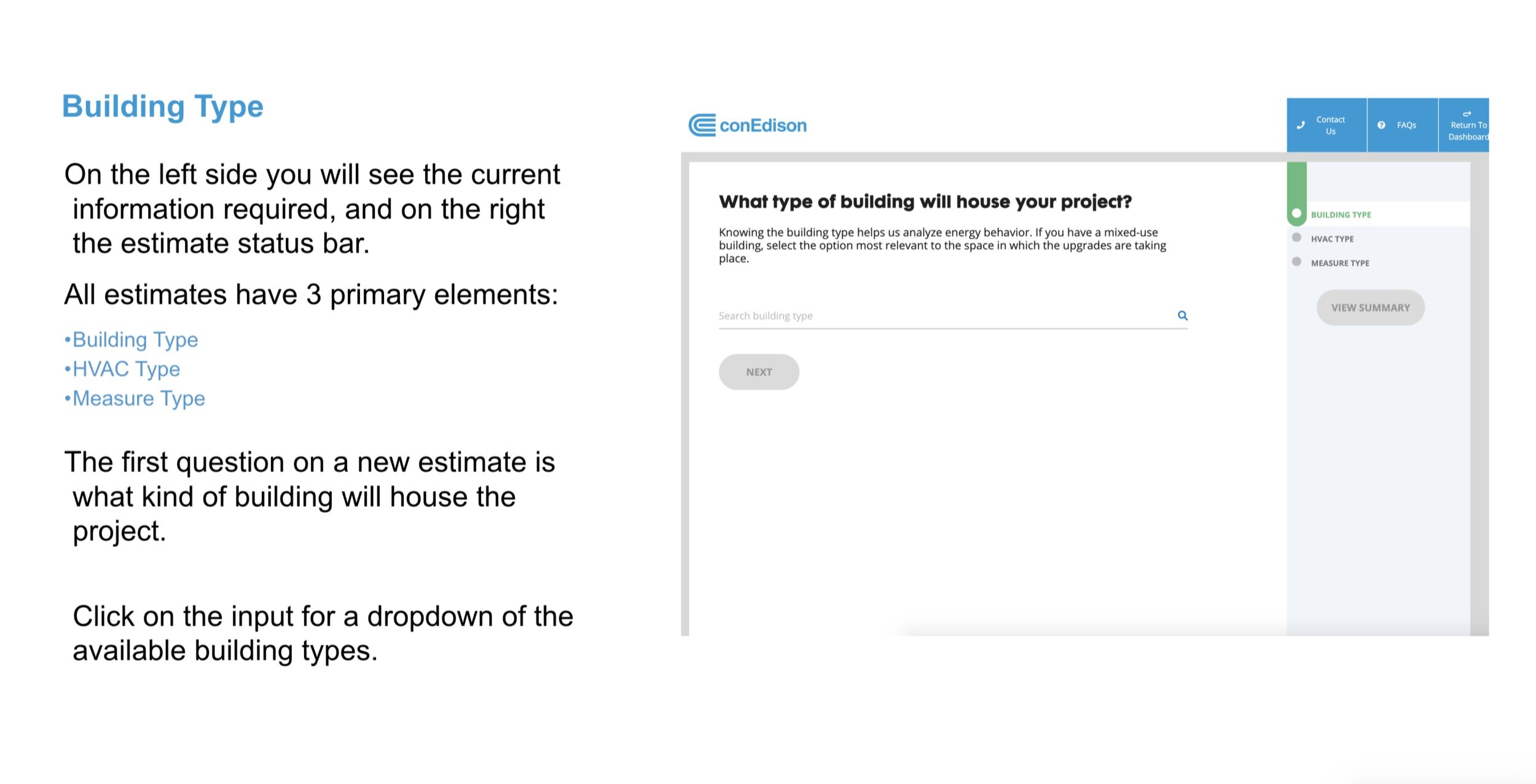
Building Type. The first question in a new estimate. A status sidebar tracks the three primary elements of any estimate: Building Type, HVAC Type, and Measure Type.
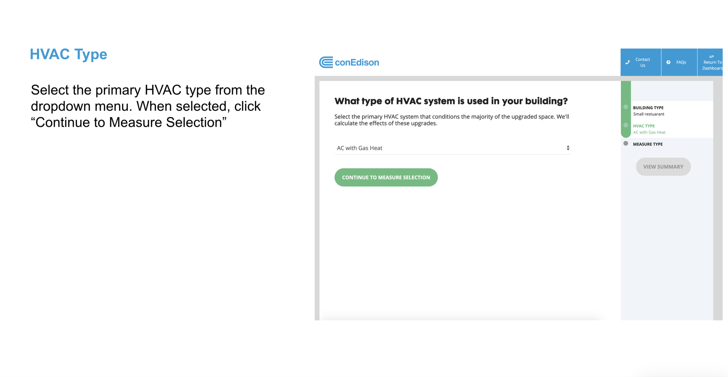
HVAC Type. Primary HVAC system selection, then straight into measure selection.
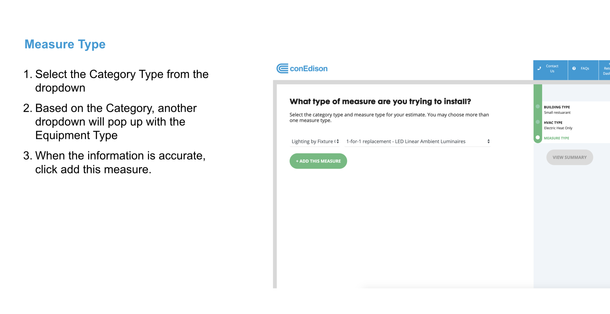
Measure Type. Category selection populates a second, dependent dropdown for the specific equipment type.
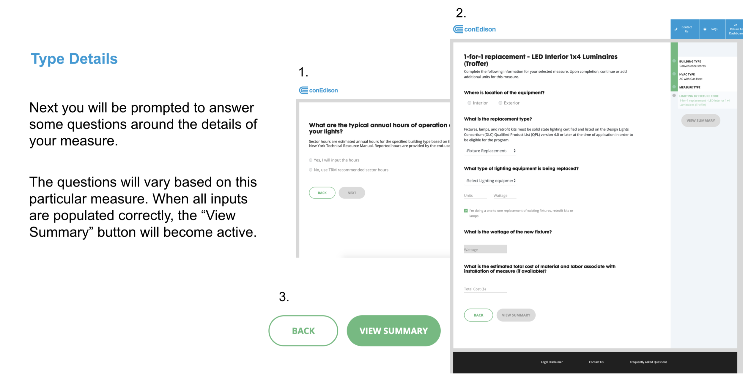
Type details. Questions specific to the selected measure. The View Summary button activates once every required input is populated.
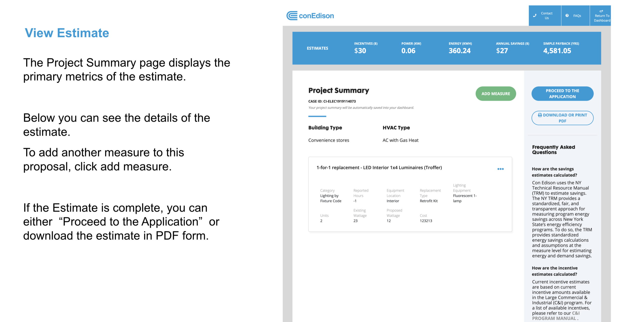
View estimate. Project Summary surfaces the primary metrics up top: incentives, power, energy, annual savings, and simple payback. From here a customer can add another measure or move forward.
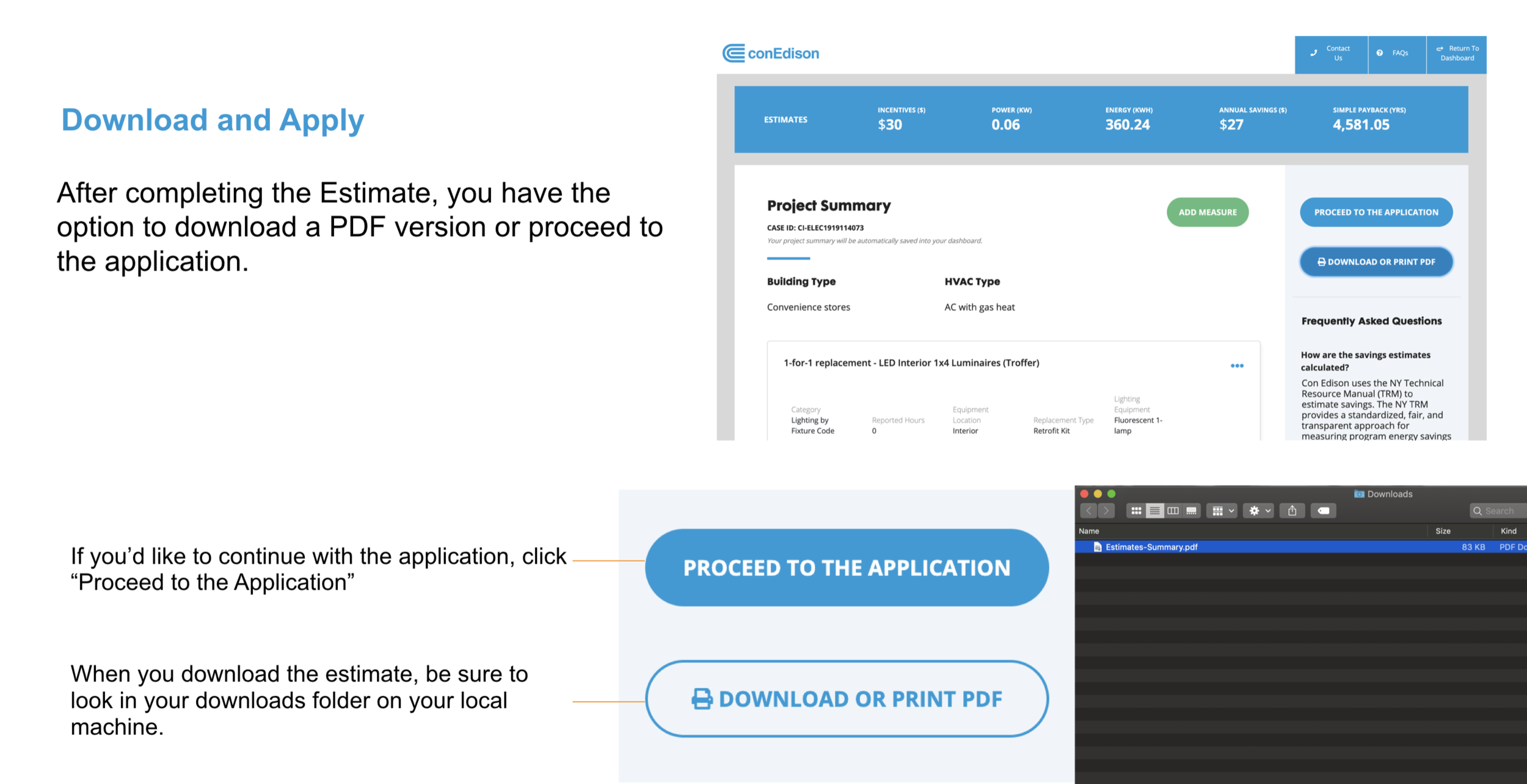
Download and apply. A completed estimate can be downloaded as a PDF or carried straight into the application, pre-populated.
Full estimator walkthrough, recorded from the working prototype.
Testing and iteration
Testing drew on a full toolkit across the project: concept testing, card sorting, A/B testing, usability testing, and surveys, matched to the question each phase needed answered. The team held itself to testing with real users almost every week, aiming for at least two participants per week across the various stages of the design. Across the estimator specifically, testing ran across twelve sprints in two modes. Moderated concept testing covered sprints 0 through 9: 30-to-60-minute sessions, in person or over Webex, walking users through key flows to validate concepts and interaction patterns before handing anything to development. Unmoderated usability testing took over for sprints 10 through 12, once every key function was designed: a full-function prototype with a task list, run through testing platforms, focused on interface-level feedback rather than big functional changes.
"To simplify the form and at least get us to have an initial conversation with a client, this is a perfect way to address that."
Participating Contractor, concept testing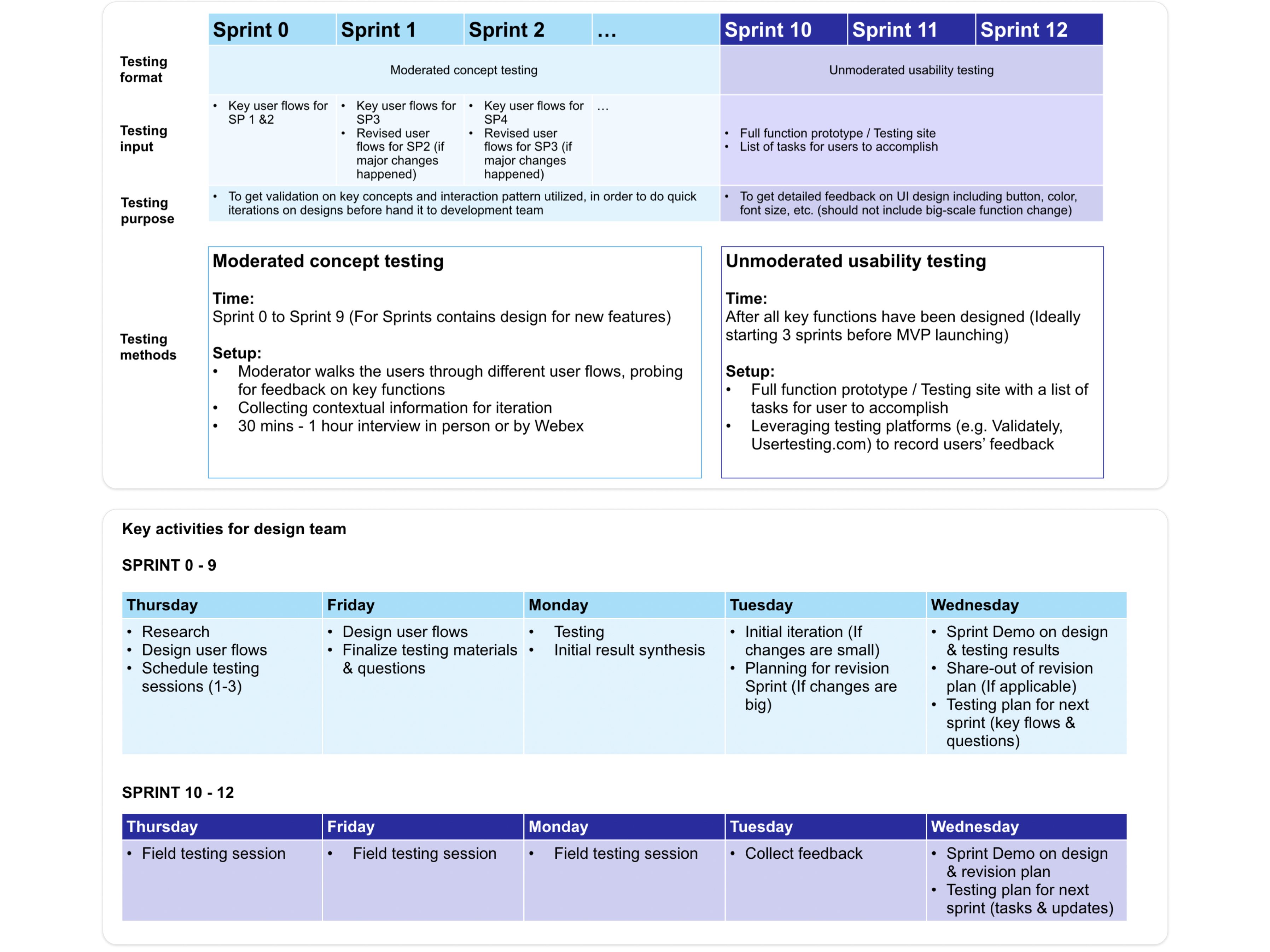
The testing plan and weekly design team cadence across all 12 sprints.
One example from those weekly demos, testing the Estimates Calculator with 2 participating contractors and 1 business developer, surfaced concrete friction: users wanted to know how long an in-progress estimate would stay saved, expected loading to take no more than 5 to 7 seconds, and wanted the "Apply" language to be unambiguous about what happened next.
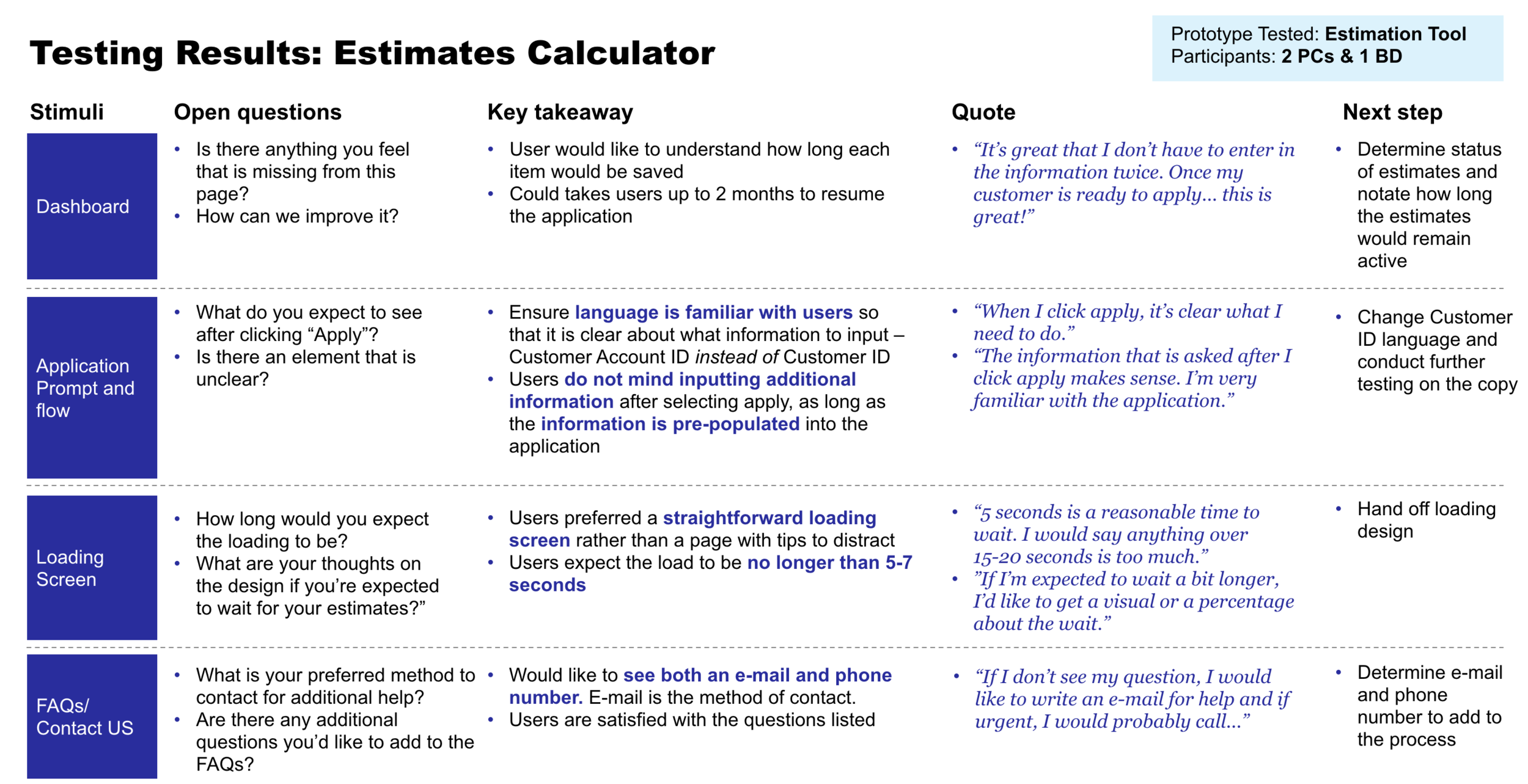
One snapshot from the recurring weekly demo, showing the format used to consistently capture and act on feedback: stimuli, open questions, key takeaways, and participant quotes.
That feedback drove a direct round of design changes:
Loading
Added transparency about load time and moved to a phased loading approach instead of a single opaque wait.
CO₂ emissions
Added an emissions estimate alongside the existing incentive and savings calculations.
HVAC measure
Added a key disclaimer at the point of confusion to reduce misreads of the measure logic.
Help
Consolidated help into Contact Us and FAQ rather than a separate, competing surface.
Navigation
Added back buttons throughout, closing gaps users hit when they wanted to revise an earlier answer.
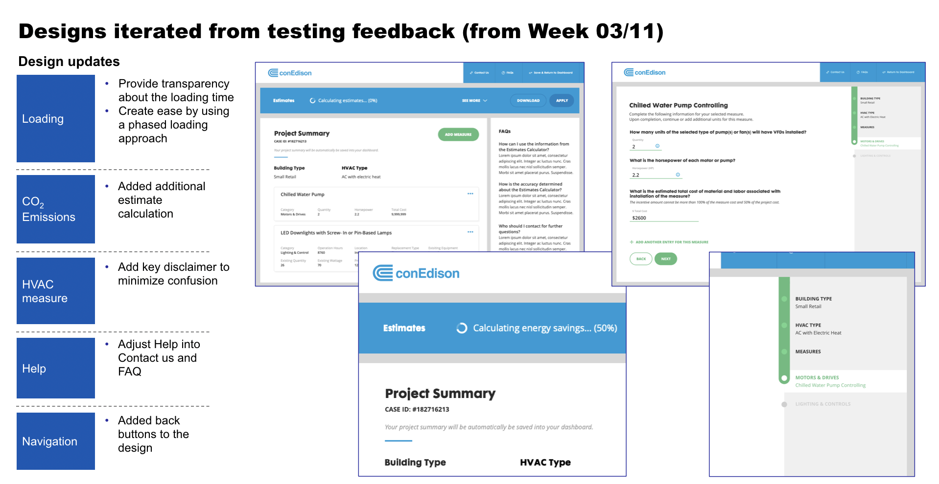
Designs iterated directly from testing feedback: loading transparency, measure-detail screens, and project summary.
Standing up a digital lab, then handing it off
This engagement was part of McKinsey standing up a digital lab embedded within Con Edison. The lab started as a group of engineers, Con Edison building capability in-house rather than outsourcing it, with a few workstreams already running by the time I was brought in as the team's first product designer.
My formal title was Associate Experience Director, which in practice meant I was the design lead: an engagement manager ran delivery, a few specialists covered product, and partners and associate partners who knew the utility industry well were setting up the broader digital lab structure. I established a process for using data and research insight to drive the roadmap and strategy, not just to produce design deliverables for development.
My piece of the broader training mandate was design. Other McKinsey team members worked directly with Con Edison leadership and coached Con Edison's own staff into product manager, program manager, and engineering roles. I was integrated with Con Edison's engineering team so they could see, firsthand, what a good design-engineering process and collaboration model actually looked like, and worked alongside my McKinsey counterparts to share design methodology and best practices across the broader engagement. I also worked directly with Con Edison leadership myself, setting them up to understand what it actually means to consider the user and how to embed that thinking into the product cycle, not just delegate it to design.
That training and show-and-tell purpose is part of why the research and presentation output here is more extensive than a typical engagement calls for, the sprint testing plan, the service blueprint, the field-level flow diagrams, the testing results deck. Cross-team partners and Con Edison leadership joined our sprint demos directly, and bringing them into the actual process of testing and iterating, not just a finished readout, is what built real buy-in. Each artifact was also demonstrating to stakeholders who hadn't worked closely with design before why the discipline matters.
I helped start the initial product, taking it from process mapping through the tested, iterated design covered above, and helped establish an initial style guide and design system, filling a real gap: product and marketing had their own guidelines, but there wasn't yet a consistent, shareable guide the engineers could build against. That system was later adapted by the team for accessibility and device compatibility as the product matured.
As the project neared completion, the work shifted to a handoff. Con Edison hired an in-house designer to own the product going forward, and my role shifted with it. I brought that designer into the team's ceremonies, standups and retros, so they had a working model of the process rather than a handoff document, and made a point of building a healthy team culture around it: getting lunch together, actually getting to know each other, not just transferring files.
Outcomes
+50%
Increase in monthly applications to the program
40%
Of customers moved forward with services
75%+
Of scheduled pre-inspections successfully conducted
4.5+
Average Participating Contractor satisfaction score, evaluated monthly
Reflection
Involving leadership and partners directly in sprint demos mattered more here than it would have on a typical project, given the show-and-tell nature of the work. Treating those demos as a collaborative, learning-oriented space rather than a status update was what actually got Con Edison stakeholders bought into design as a discipline, not just the specific product.
Planning the launch and analysis approach earlier would have helped. It's easy to leave that until the product is close to shipping, and by then there's less room to build in the measurement you actually want.
Scope needed to be defined more explicitly at the start. As the project neared completion, new ideas and requests came in that weren't always aligned with the original KPIs. With four stakeholder groups and a training mandate layered on top of the product work, it was easy for the project to expand at the edges. Continually refocusing stakeholders on the original goals when new asks came in would have made the back half of the project smoother.